Foil Submission Guide

There are good foil images and there are bad foil images, and then there are foil images that have to be labeled as foil images because you couldn't tell without it. This guide will lay out what to look for when capturing foil images and give plenty of examples of what to imitate.
Once you've read this guide, head over to the List of Foil Cards and start looking for candidates to document!
Foil Background[edit]
The foil effect on cards actually comes from the paper, which has a shiny layer added to it. Decipher produced foil images that pop by printing foil-obscuring ink on the card so that only parts of the image would shine with the rainbow effect. This was done by producing a black-and-white mask for each foil image that looked like this:

The black indicates where there would be no foil, and the white indicates which parts will have both the printed color and the rainbow diffraction foil effect.
As you can see, this is an image with sharp edges and a defined shape. From a certain point of view, the purpose of documenting foil images is to determine what the original shape of the foil mask was, so that the effect can be recreated digitally in future projects (the historical preservation is a well-received bonus, however!)
Standards of Foil Images[edit]
We would rather have a sub-optimal foil image than no image at all, but that's no reason to purposefully accept poor images if it can be avoided. Foil images should try as much as possible to do the following:
- Include the foil image of the entire portrait
- Display the entire sharp border between foil and non-foil
- Shift the color around to make it distinct from the normal portrait colors
- This means get a color other than green for Wraiths, and other than red for fire
- Be in-focus and non-blurry
- If possible, include foiled icons and other foil elements of the card (but only if the portrait is also fully covered! That takes priority)
- Provide an image that is as high resolution as possible
- This also means trying to fill the entire photo space with a card, if possible. There's little use for 100,000 pixels if only 10,000 of them are the card.
- If your cards are sleeved, make sure they're invisible and don't show up in the image! There's little use for a foil image that has wavy white bands of light crisscrossing the important part of the image.
Notably, while foil images should try to be straight-on, there is much less of a problem with skewed images than there is blurry, low resolution, or incompletely foiled images. If you have to get it from the side, then get it from the side!


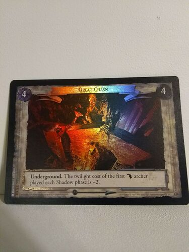
When taking photos of foil cards, act as if we are attempting to document the exact foil coverage of the portrait so that it can be recreated digitally. See the following examples for excellent foil images that capture 90+% of the portrait and can easily be recreated digitally:


Notice how each of these are so sharp and crisp that recreating the black-and-white foil mask would be as easy as tracing the shape out! This is the goal for each of our foil images.
You may find it easier to capture good foil photos if you use a flashlight, and you may also have better luck if you shoot in low-light conditions. Experiment to see what works best for you!
Common Failure States to Avoid[edit]
These are examples of foil images which are not suitable for submission to the wiki--there comes a point where it is better to not lie to ourselves and just keep the "not found" placeholder:
-
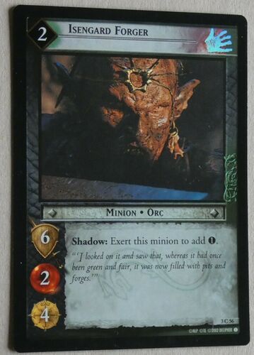
Here, the foiling is evident in the culture icon but almost nowhere else. You can hardly tell that this is a foil Isengard Forger (3C56)  .
. -
The foiling here is okay, but the image itself is cut off, and what's more there's a thumb in the way. The amount of work required to photoshop this into usability probably pales compared to simply taking another photo. -
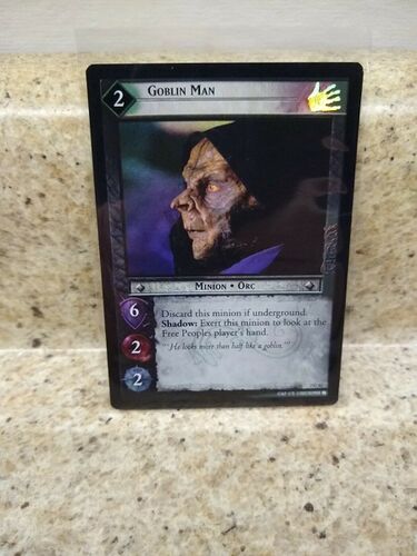
The foiling here is very slight--if you look closely, you can see how the background is probably foiled, but it's still hard to tell the difference between this and the non-foil Goblin Man (2C42) 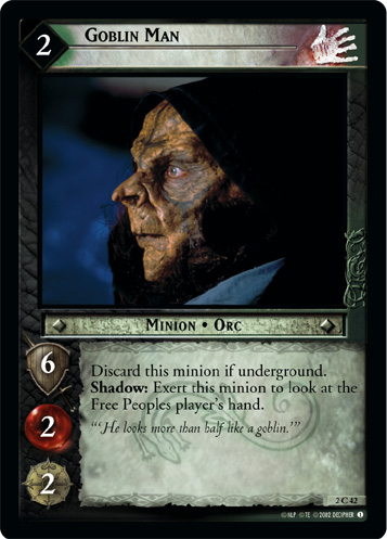 .
. -
Here we can see the colorful foil effect on much of the image, but we would be at a loss to recreate it. There are no sharp borders at play showing the foil/nonfoil border, and where it goes on the right and left are a mystery. We can make guesses, but it's better to have proof. -
Has there ever been a better capture of the foil effect at a lower resolution?? This photo would have been one for the ages, except it's the size of a postage-stamp. If you can't read the text, it's probably far too small. -
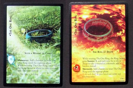
Here The One Ring, Such a Weight to Carry (7R2) 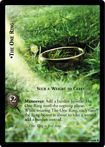 has the blue/green highlight, and The One Ring, The Ring of Doom (15R1)
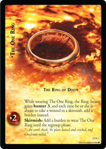 shows red. In both cases, it's very difficult to tell where the image coloring ends and the foil begins. Technically the foiling is there, but we can't see it!


